Hello everyone! Some of you may be familiar with my novel, Paternus, from last year’s SPFBO competition hosted by Mark Lawrence (Archsaint of self-published authors). Paternus was Fantasy-Faction’s pick for the final round and ended up taking third place out of three hundred entries. Even with that success, I’ve decided to give the book a new cover.
Why, you ask?
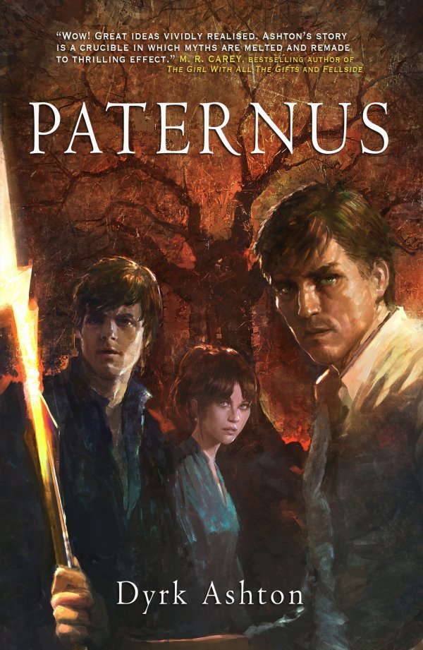
For a while now folks have been saying that Paternus looks like a YA novel, or even aimed at a younger audience. And they’re right. Here it is:
There’s nothing wrong with YA, teen, or even grade-school fantasy. I read it myself. But Paternus isn’t any of those things. Couple that with the fact the description I’ve been using speaks mostly about a seventeen-year-old girl living with her uncle, and a decidedly YA-feeling first chapter, and I think the audience has been getting confused. I can’t blame them. So, Paternus is getting a whole new look.
A Tale of Two Covers
Don’t get me wrong, I love the first cover, and so do a lot of other people. The art is amazing, and it makes sense in terms of the story.
But here’s part of the problem – it only makes sense after you’ve read it (or if you’re the knucklehead who wrote it). If you don’t know anything about the story, taking from a number of observations made by readers, the first cover makes it look like a Hardy Boys/Nancy Drew mystery with elements of Harry Potter and “an inexplicable appearance by Zooey Deschanel.” I’ve even heard talk about Pokemon. I realize now, with good humor, it totally does look like those things. I get it, and it makes me grin. And again, the story isn’t like that at all. Sorry for the confusion. My bad. I told the artist what to do and he delivered beautiful work. It’s just not working.
But here’s the cool part. Since I’m self-published, I can change it if I want to, whenever I want to. And so I did.
Drum roll
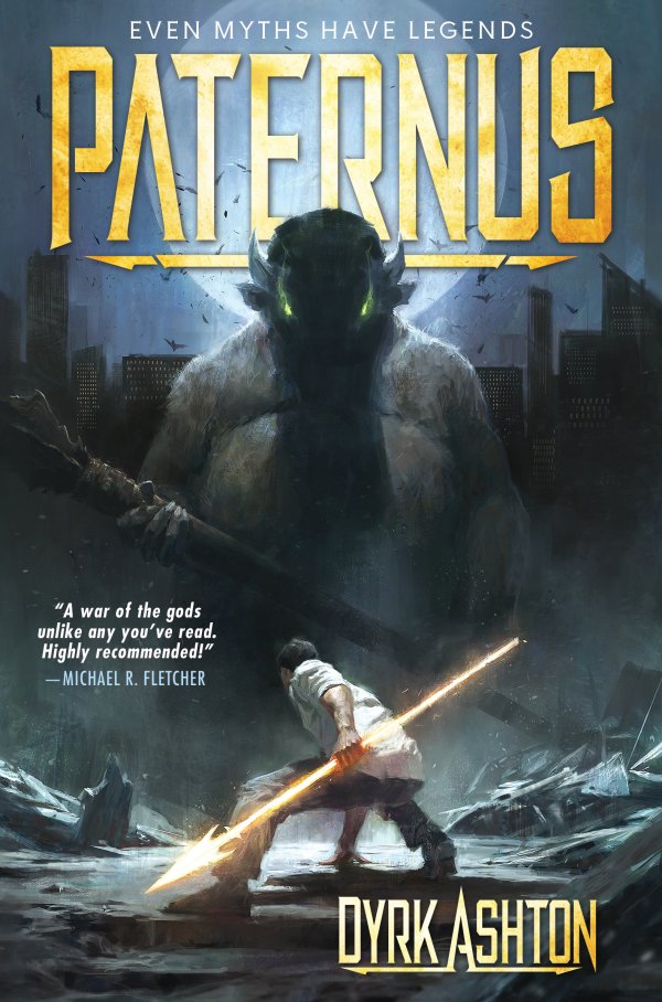
I found an amazing artist named John Anthony Di Giovanni through fellow author Michael R. Fletcher. John does a lot of work in the new style I was looking for, as well as many others. He read the book and we discussed the idea we wanted to get across. We were looking for something not YA, something that shouted MYTH, MONSTERS, foreboding, and action in a modern setting, and that made the point quickly and in a striking manner. He made up some amazing concept sketches.
I loved them all. We talked about them and went through a few phases. Along the way we came up with an awesome Stars Wars-reminiscent montage-style poster (yet to be revealed), a gorgeous painterly character line-up banner (now gracing my Twitter and Facebook profiles and website – feel free to use it for yours, too!), and — (drum roll please) — this:
And not only did Anthony do the front, but also a full wrap of spine and back:

For the original cover, I got some help from a graphic artist to do the layout of the back of the book, but I tweaked it (because I’m a freak like that), and I did the front cover lettering myself. Since then I’ve learned more about cover design, seen some amazing work by independent designers, and even discovered the word “typography.” I saw the jaw-dropping work of designer Shawn King of STK-Kreations and contacted him. He said yes. And he did this, the final of the new cover for Paternus – TA DA!:
For the “full effect with the hump,” here’s the completed wraparound:

I hope you like it. I sure do. The new version should be available on Amazon within a couple of weeks. I’ll announce it like crazy on my social media accounts when I know for sure.
Brand New Branding
As a final note, just FYI: the new cover edition includes a different description, a whole batch of awesome testimonials (front, back and inside). On top of that, the first two chapters have been swapped, and there’s now a sneak preview of book two — the full first chapter!
Thank you for taking a look, and my heartfelt gratitude to all who have already supported Paternus, even with its ambiguous branding. Thank you Anthony for your patience and the wonderful art, Shawn for your time and terrific talent, and special thanks to Fantasy-Faction for letting me do the reveal on this amazing site.


That is a 100% improvement, well done! Particularly love that new typography. Is that expensive out of interest? I dont have much of an idea on those fronts, but i guess thats part of the research.
Thanks Marcus! “Expensive” is a relative term, and I can’t in good conscience pass on what I paid for the sake of the artist and designer. You’d have to ask them 🙂
Excellent!
Thank you Mark!
Love the new cover spread, front and back,. Now looking forward to book two, thanks Dyrk.
Much appreciated, thank you Lady Ty 🙂
Fook me… that is superb!
Thank you for sharing the process of bringing this work to life; you have my interest now and a desire to follow it’s success.
Peace,
Terry
Wow, Dryk! Incredible. Great hook line as well to add on the design awesomeness.
The Dyrkster has done it again. Bravo, brother. Bravo!
Exciting! Chilling! Brilliant! So proud of you!!!
Oh it’s so perfect, Dyrk! Love it!
[…] It looks AMAZING, guys. Check it out! […]
Thanks everybody! It was all Anthony and Shawn, but I’ll bask anyway 🙂
Both covers are beautiful. I do feel that the new cover captures the genre and tone you’re going for, based on your description. And it definitely catches my eye a lot more (though due to personal preference).
I think this is a great example of why traditional publishers tend not to give authors too much say in covers by default. These books are our baby, and we want the covers to be as accurate as possible.But It’s sometimes more useful to let go of accuracy and capture the feel of the novel instead. Get people to pick up the book based on the genre the cover conveys, and let the blurb be accurate instead.
Just thinking aloud. 🙂