 Covers. We like to pretend we don’t judge books by them, but on some level we do. And that’s really ok. Here’s why:
It’s NOT okay to judge people by their appearance for a myriad of reasons, and that’s why we use the expression to talk about people, but books aren’t people. Books, by and large, are a form of entertainment, and when it comes to forms of entertainment, we are looking for something that suits our immediate needs. If we had infinite time, and infinite funds, we might be able to at the very least start reading every book available to us before we decided if it’s for us or not. But I don’t know anyone with infinite time or infinite funds, and so we need a shorthand of some kind.
Enter covers.
Can a great book be hidden behind a terrible cover? Absolutely. It probably happens more often than anyone would care to admit. Can an absolutely gorgeous cover conceal and absolutely terrible book? Of course. A good cover does not equate to a good book and vice versa, which is the reason for the old adage in the first place. However, in the end, a cover is a marketing tool, and, like all marketing tools, it can help readers find the right book for them in that moment.
The biggest job a cover has (especially a cover that is not for a big hitting author with name recognition) is to indicate genre and subgenre, convey a few key themes and elements from the book, and draw the eyes of the target audience. Whether or not a book succeeds, can be subjective, and many of those markers change with time and trends. So, a cover that was once excellent can become dated and less useful in just a few years.
Enter the point of this post.
When I first published Blade’s Edge, no one had heard of me (largely still true today) and I knew in order to sell my book I was going to need a killer cover. I didn’t even know where to LOOK for a cover artist who worked with indie authors at the time though (I only stumbled upon Kboards a few months later, much to my chagrin) but I knew, after years of reading big-name, traditional, fantasy novels with TERRIBLE cover art, I wanted to make the best use of indie publishing by insuring my book had a great cover. And lo and behold, I read an SFF thriller by A. G. Riddle, loved the cover art, and when I asked him who the artist was, he told me and passed along his email address. A few emails later I realized I found my dream artist, and also realized I was going to have to crowdfund my book if I wanted to hire him.
So, I did.
I ran a Kickstarter back in October of 2014 and successfully raised enough money to hire not only a professional cover artist, but a cover designer, and an editor as well. (I wound up doing the formatting myself after painstakingly learning the ropes of print and ebook formatting, but I shelled out a hundred bucks extra to have a pro formatter check my formatting job for errors.) So, in 2015 Blade’s Edge went to print with the following gorgeous cover courtesy of Juan Carlos Barquet and The Book Designers.
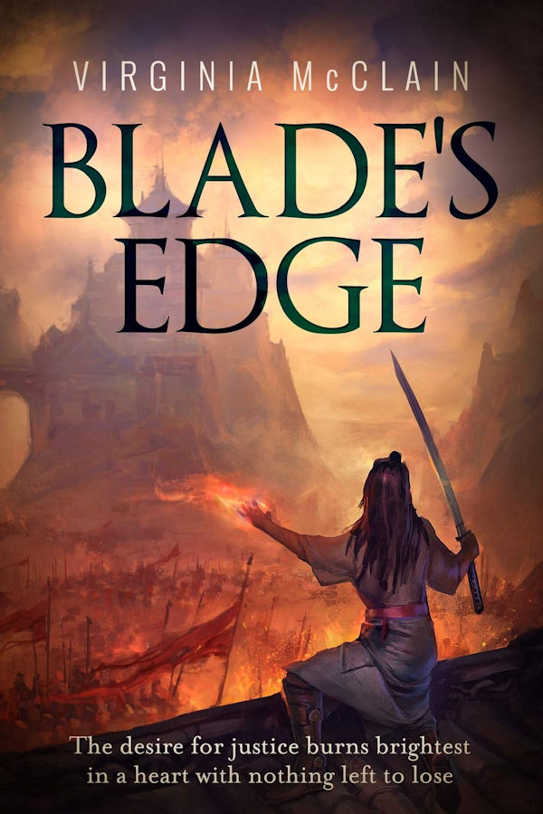
I was in love with it, and so proud of it, and I honestly figured I would never ever want to change it. I loved it so much, in fact, that I hired Juan Carlos Barquet to do the original artwork for the sequel as well. And Traitor’s Hope went to print in 2017 with an equally gorgeous cover I was in love with. Shown here.

I still love those covers. I really do. I don’t want to change them at all. But…
But I am writing a third book, and I can’t really afford another Juan Carlos Barquet original, and even if I could, the artwork doesn’t quite fit the newest book as well it did the first two and also… I know a lot more about cover design now than I did five years ago. Namely, I know about trends, and genre markers, and target audiences. Blade’s Edge and Traitor’s Hope both have beautiful covers and I don’t think I’ll ever stop loving them. But they don’t quite meet genre trends now, and they don’t quite target the right audience and they don’t quite work with the next book in the series and… It was time for a redesign.
It happens to trad books pretty often, actually. Especially with the more successful series (which is funny because they are the ones that probably need it less since they sell on name recognition), but lots of series get design refreshes periodically, and I suppose I shouldn’t feel weird about it.
But I do.
Because I designed the new ones.
Does anyone here play World of Warcraft (WoW)? (No, look, I swear it’s not the total non sequitur it sounds like. I have a point, just bear with me.) In WoW you can have two professions, right? But only two because it’s a game, and thus, you really want your two professions to complement each other so you can be as self-reliant as possible otherwise you spend all your time waiting around for auctions to close so you can buy enough supplies to make all your own potions/armor/jewels etc. In other words, you save money and time by doing two jobs that complement each other.
So, if writing is my primary profession, design work (formatting, graphic design for marketing, and…yes…cover design) is now my secondary profession. I sort of just fell into it because I like watching photoshop tutorials on YouTube, and it’s way cheaper to make your own marketing materials than to hire someone every time you need a new ad image. Also, I was already doing my own formatting, but it turns out that’s more fun when you can design your own chapter headings and between chapter headings and ad images and all of those photoshop tutorials. Well, one thing led to another and eventually people started paying me to design their covers.
And, in indie circles, there’s an adage that’s almost as well-known as not judging a book by its cover; we’re not really supposed to design our own. The truth is, I really don’t recommend most folks design their own covers. Really. Even after other people started paying me to design THEIR covers, I still didn’t design my own. I hired the exceedingly talented Natasha Snow to design my entire Victoria Marmot series and she did an amazing job.
But, on a whim, to pass the time because of covid and because I needed some extra inspiration while I was writing it, I made a cover for my newest book in the Chronicles of Gensokai series. And I liked it so much I decided to keep it. But, then I second guessed everything and decided to hire a different designer to work on it, one whose work I had adored for a long time and who I thought would be a great match for the series. Only, it turned out she was booked for a few years out and wouldn’t be able to do it. But when I showed her the cover I had done already, she said I didn’t even need her. Which kinda blew me away. She also encouraged me to attempt the redesign for Blade’s Edge and Traitor’s Hope myself.
So, I did. And now she and a few other folks have reassured me the covers are, in fact, good. I have tried to reassure myself that they are at least on trend for 2020 fantasy featuring teenage protagonists and….
Well, fine, you take a look.

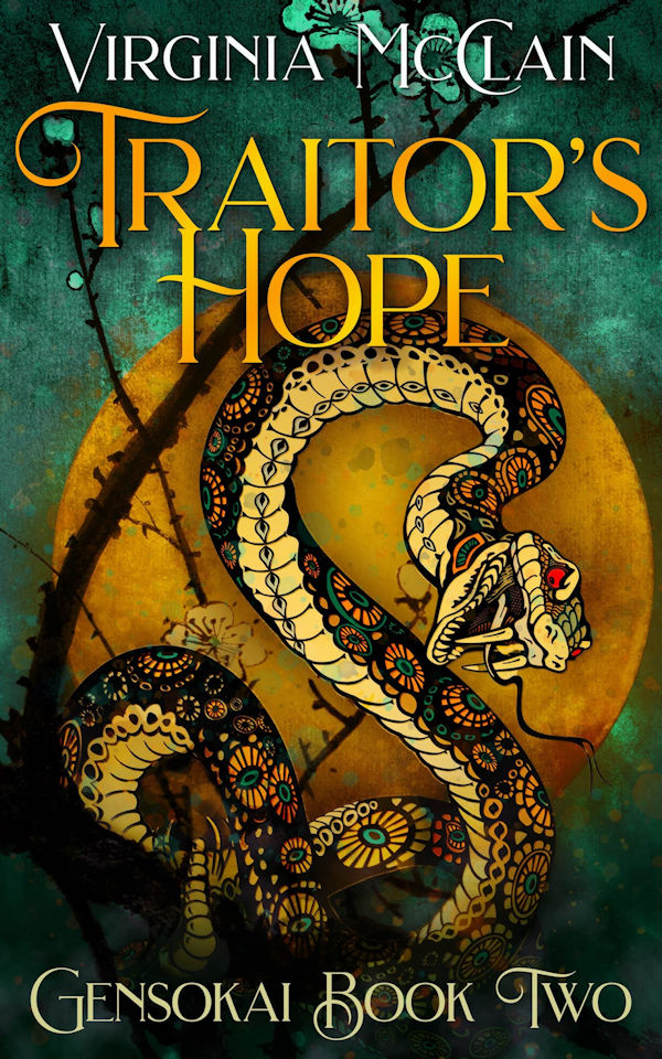
They were very fun to design, and they make me smile, and I think I actually love them, even though I also still adore the original covers too. We’ll see if they help these two books find new readers. I’m sure some folks will see these and think I’ve made a terrible mistake. I know I can never top the artistic talent of my original cover artist, but…well, that’s not the point in the end. Covers are marketing tools, and while I’ll always love the artwork I first published Blade’s Edge and Traitor’s Hope with, I’m going to try a new marketing tool for now, and see how it goes.
If you’d like to order your own copy with the shiny new cover you can find Blade’s Edge here, and Traitor’s Hope here. The print versions of the new covers will be available soon but haven’t gone live just yet. In addition to the new covers, I’ve also redesigned the absolutely sad map I made years ago. Here’s the old one:
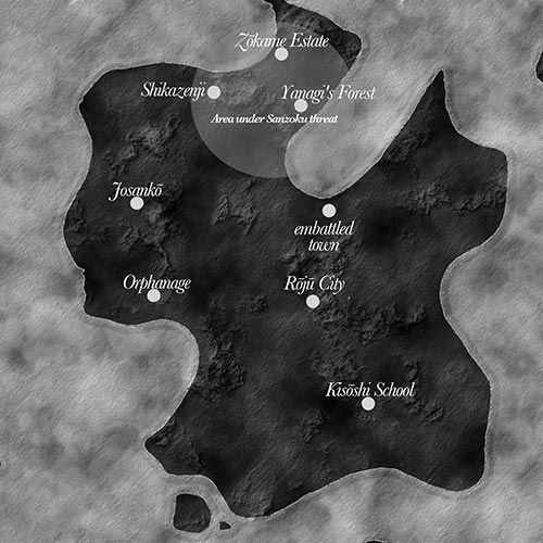
(Yes I know, it was… I had no idea what I was doing, okay?)
And here’s the fancy new one!
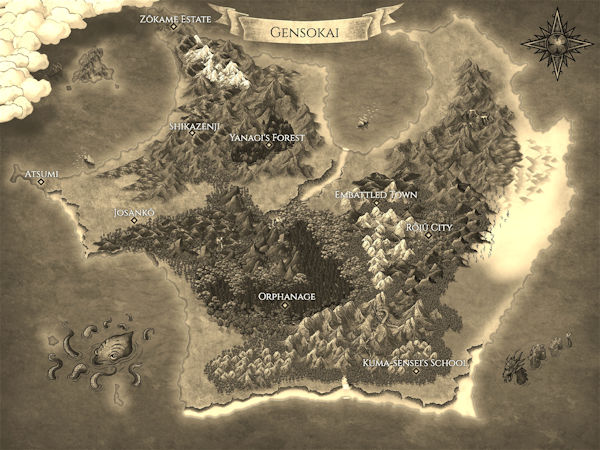
If you already own Blade’s Edge and Traitor’s Hope you can go into your digital content manager on Amazon to get an update of the new cover and map. If you don’t own them already, but think you might want to, you can find Blade’s Edge here and Traitor’s Hope here.
So, that’s the story of how and why these new covers came into existence. And, once we get closer to its release date (February 15, 2021), I’ll be very excited to show you the cover to Sair?’s Claw, which is the cover that really started this whole debacle.

